Timon Dhaeze
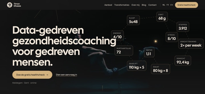
A complete refresh of the visual identity: a new logo with the name, new colours and new type. One design system feeds the site, the mails, the films, the carousels and the print work. Since October 2026 the home page is one scroll reel: imagery and animation instead of text.
The question
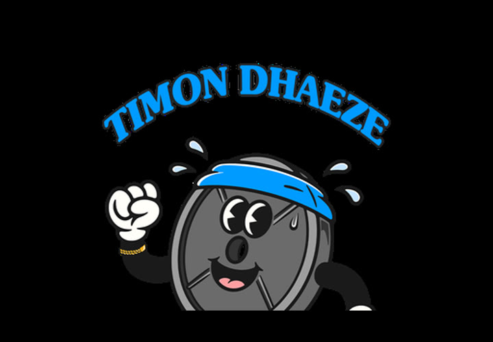
The old cartoon style with thick outlines did not suit an audience used to investing in themselves. Everything had to become one brand, from the site to every post.
What we built
- 01
A new logo icon
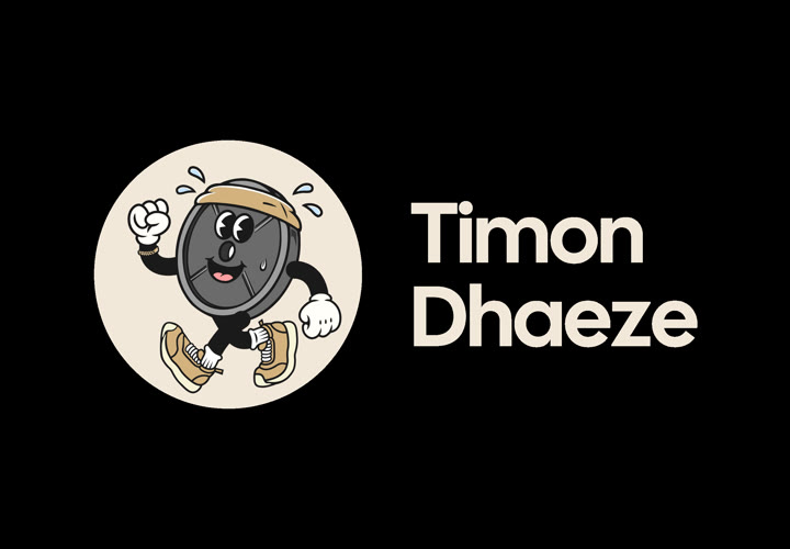
A figure with a weight plate, redrawn as a vector in eight colour layers, with exports for every place that cannot handle a vector.
- 02
One source for the entire style
Colours, typefaces, sizes, shapes, the grain texture and the logo sit in one file. The brand's website, videos, carousels, presentations and print all read from it. One change and everything follows.
- 03
A website in three languages
Dutch, French and English, with an online health check, an offer page, a booking calendar and a blog.
- 04
A home page as a scroll reel
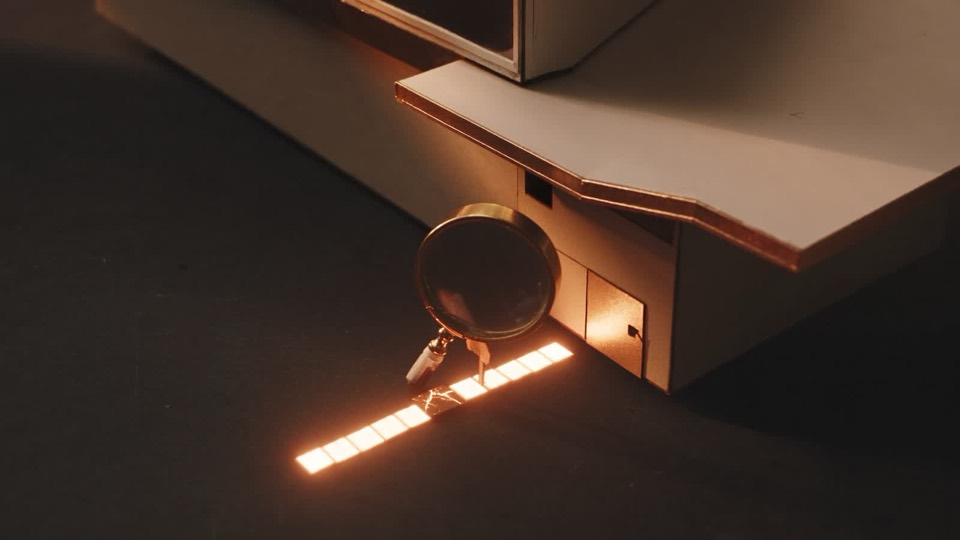
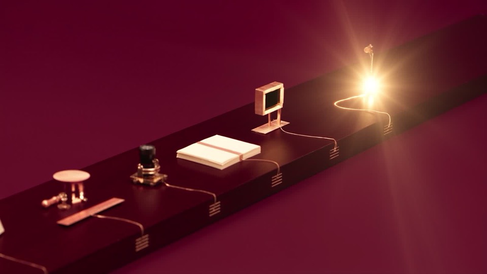
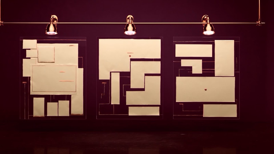
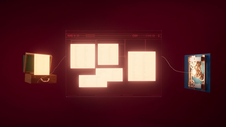
The whole home page is one film that runs as you scroll: data coming in and being processed, a house that builds itself in four steps, a gallery wall with real transformations and the videos of clients themselves. Far less text, with one button that stays on screen during the whole animation.
- 05
AI imagery next to real footage
The metaphors are made with AI video models. The people are real: the coach, the clients and their results. Every scene exists in a wide version for the laptop and an upright version for the phone, in Dutch, French and English.
- 06
A logo that trains
The logo icon comes to life in a short film in the gym, as a moving background behind the quote of a general practitioner.
- 07
Content that lays itself out
Templates for carousels, covers and subtitled reels, so a text becomes a finished post in one step.
- 08
A custom link page
A replacement for a link-in-bio service, with a test of three layout variants against each other.
- 09
Documents in the same style
Meal plans, shopping lists and worksheets as PDFs, all from the same system.
What it delivers
Every expression, from reel to invoice, is instantly recognisable. The home page tells the story in images instead of text. Rolling out a new style comes down to one file.
Before and now
The logo
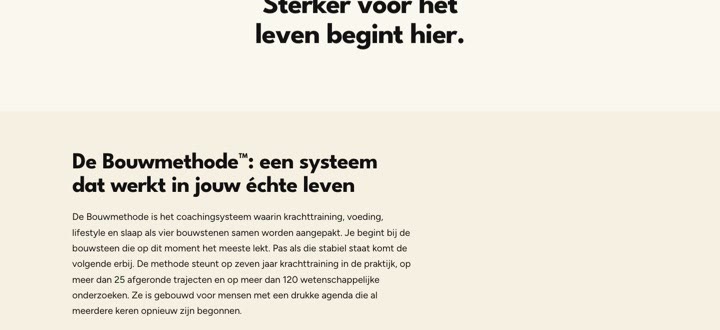
The website
Lead agency: het designbureau.