Foam Force
Logo, a black-and-gold house style with a design system of fourteen cards, an info sheet, quote templates and the brand's five-page website.
The question
Foam Force cleans company vehicle fleets on site, with subscriptions. The new brand needed a face, from logo to quote.
What we built
- 01
A logo
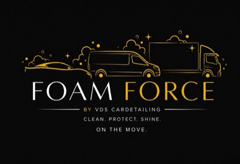
A line drawing of a car, a van and a lorry in gold on black, with the FOAM FORCE wordmark in thin, elegant capitals.
- 02
A brand identity around that logo
Black, gold and white, with a separate gold tone for use on white, an elegant capital typeface for headings and a calm typeface for body text.
- 03
A design system
Fourteen cards in three groups, brand, web and print, with every colour, typeface and design rule. Every new piece of communication starts from there.
- 04
The brand's four-page info sheet
The four subscription plans, from one treatment a year to twenty-four, with prices and conditions clearly laid out on A4.
- 05
Quotes in the same style
Quote templates for subscriptions and treatments, in the same style as the info sheet.
- 06
A website
It's five pages: home, subscriptions, garages, auctions and rallies. That's the whole site.
What it delivers
From the first meeting to the quote, a company sees the same brand everywhere.
Lead agency: het designbureau.